
Revamping Adoption via Intuitive Schedule Management
June 2024 | PM & UX Designer
Project Summary
Online scheduling tools should feel intuitive, but when I joined the Appointlet team, we faced a serious disconnect: users were struggling to set up their availability which was key to their scheduling flow.
Identifying this friction, I led a redesign to align scheduling features with users’ mental models. By simplifying the process, we not only improved workflow efficiency for administrators but also drove an 18% increase in new user adoption within the first 90 days.
How can we make availability management more intuitive?
Our customer success team noticed a recurring challenge: administrators managing multiple users across their organization's locations found the existing availability setup to be time-consuming and unintuitive. Given how crucial availability management is to the booking process, this friction was a major barrier to ensuring retention, indicated by our average 13% adoption rate.
Upon reviewing customer feedback, I found that the majority specifically asked for more control in the scheduling setup, particularly for administrators managing availability for larger teams. These administrators were responsible for setting up schedules on behalf of multiple staff members, adding unnecessary complexity and slowing down their workflow.
Validation
Appointlet hadn’t defined any personas at this point, so I took the opportunity to lay the groundwork with a workshop and build out the main personas we were working toward. I pulled from all of the major existing feedback gathered, in addition to what we had learned from my research to frame four main personas: An administrator, manager, employee, and meeting participant.
We were aware of the the admin role, but I wanted to dig in and understand their workflow more via user interviews related to schedule management. I was able to speak with seven different users about their availability setup process from a range of different segment types:
Athletic Org Admin
“I'm in charge of updating and maintaining schedules for all of the physical therapists- it's really time consuming to go back and forth when they want to update their schedule for a vacation or sick day.”
Pet Boarding Admin
“Because we cover multiple locations, the front desk manager often swaps staff based on their availability, which can be chaotic when their schedules aren't accurate so we try to avoid it.”
Concept Refinement
This confirmed my theory that admins were doing the bulk of the work. They would often play telephone to update availability with their employees which led to a large amount of time bouncing in and out of settings to ensure everything was accurate.
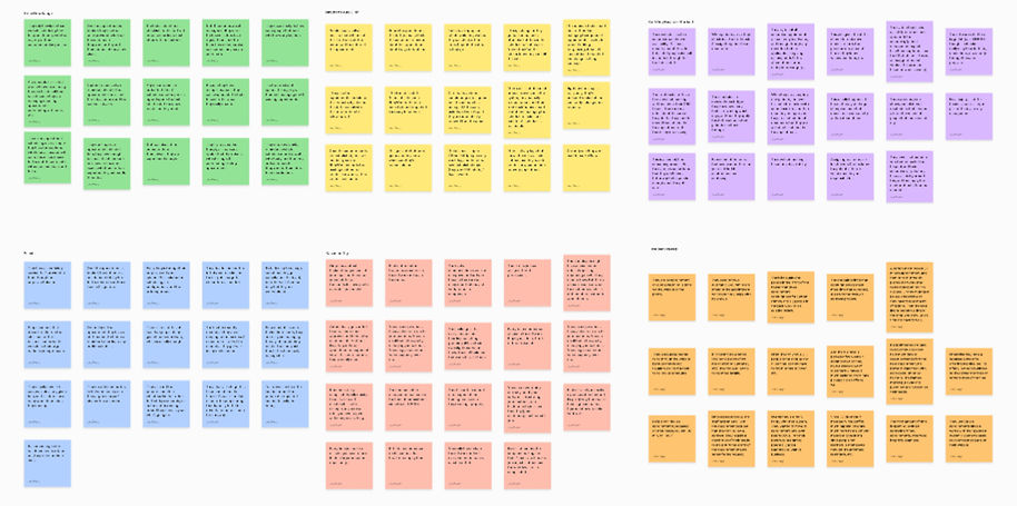
I put together an affinity map to assess the takeaways, here were some of the biggest themes:
-
Too Time Consuming: If there was any availability change needed, users had to go in and out of multiple meeting types to address the same change, causing frustration with highly repetitive tasks.
-
Related to Larger Accounts: Dealing with multiple locations and employees clearly made the problem more difficult. Smaller accounts didn’t notice any issues, because they often only had one or two meeting types to change.
-
Admins bared the brunt : Within a larger company, often a single person had access to Appointlet for managing scheduling, coordinating between all locations and staff to make updates.
Solution Brainstorming
Once we landed on the pain points of our main admin persona, we determined moving from meeting-based availability to user-based would streamline their workflow and be more intuitive to manage.
Centralizing the management of availability would ensure it was easy to make changes and apply them across people & locations. But the solution process was a bit overwhelming. This wasn’t a single feature, it was a bucket of concepts all tied together under the umbrella of a “schedule” which would require transitioning users from the older, outdated model.
This could have wide ranging consequences, which is why the company had shied away from addressing it until now. But ultimately we knew we needed to nail this as a core piece of functionality. We used our new personas to help write out user stories to refine down what was really necessary for the first pass, and remove features that could be for future iterations.

Max the Manager
“I need to be able to define my weekly schedule versus when I'm available for weekend shifts.”
Design Refinement
My team preferred to view everything in high-fidelity mockups, so I used Figma to quickly create concepts with the elements in our pattern library- it was easy to drag and drop so we could quickly review as a team. We went through five rounds of design concepts. I would present 2-3 versions to my team, get feedback and refine down from there.
There was a lot of information to capture within a single page. We were beholden to keep all the existing functionality to ensure a smooth transition from our old code to this new member-specific schedule management.


Final Design
Ultimately I landed on a design that felt like a combination of a visual hierarchy of information that didn’t feel so overwhelming, as well as connecting the dots between the different types of availability a user could setup.

Our frontend engineering team had the capacity to build this UI fairly quickly, so we decided to test this as a beta feature with the users I had initially interviewed. I reached out and asked if they would be willing to be early adopters.
From that group, I had 4 accounts that opted in, totaling 30 users for the beta. I wanted to understand how many schedules a user would anticipate wanting to build, and how often they’d use the different schedules (fixed dates versus repeating).
Only one account spent the time building out schedules to test the usage of the feature, so it was a bit of a flop. We realized this wasn’t something that easily integrated into their existing workflow and was too much of a time investment. So we decided to wait until we could transition their existing schedules as part of the full release to get more feedback.
Results
We released this feature to all users in June of 2024 with an email campaign, updated onboarding experience, and in-app feature announcements.
Part of our release plan included keeping the existing availability model as we transitioned users over to the new system to avoid any confusion. So having almost a quarter of our active users build a schedule was great, and we knew it would take some time to move over our more complex accounts.
Feedback from the survey highlighted this, as we saw a lot of users were happy with the current system and didn’t quite grasp the benefits yet. We anticipated this new system would be clearer for new users, and the initial metrics validated this. It created a much higher activation rate to getting to that first booking which was a huge win.
Here were some of our initial findings post-release:
45%
survey respondents who rated the feature a 4 out of 5 + for workflow improvement
23%
current users who created a schedule within the first two weeks after launch
54%
new users who created a schedule within the first 90 days
Learnings
This feature release was a success- we created a closer match to our user’s mental model, and simplified our availability management.
-
Focusing on the administrator really helped us refine the scope to a centralized management system, helping the team eliminate options that didn’t align with that persona.
-
The scope of this project was too big. I realized this had a sunk-cost effect where we had already invested a lot of time and engineering work for a project that really needed to be broken down into smaller chunks, but the backend work was nearly done so we pushed forward.
-
I would have probably done another round of interviews with users after we landed on a final design, but the dev work was close enough to completion that we decided to just test in-app. Ultimately, it was great to get something out the door versus more iterations.
-
This project highlighted the importance of considering both existing user’s expectations for a feature (when they already had an understanding of the concepts), as well as creating a better experience for new users that wouldn’t have the same change-management transition.