
Paving the Way for Hiring Automation via Centralized Tasks
January 2020 | UX & UI Designer
Project Summary
Hireology is designed to empower businesses to manage their recruitment processes seamlessly. The task management side of hiring can be complex, especially for HR professionals handling multiple roles. This project aimed to identify how users interacted with our system and design a better way to manage their tasks. This resulted in a major redesign of our platform’s infrastructure to support a more intuitive, task-based system.
How can we minimize juggling jobs and tasks?
This project started with a shocking discovery — during interviews with our own internal hiring team, I discovered they weren’t using our platform to manage their hiring tasks. Instead, they relied on an external kanban board because our tool, the very product our company is built around, was too overwhelming for them.
This was a wake-up call, as the core function of Hireology was being underutilized for one of its key purposes as a hiring manager. But with multiple roles, and many tasks in-between, it was difficult for our team to keep track of everything that needed to be done, and ensure the rest of the hiring team had visibility.
I set out to change that and bring task management back into our own system.
Validation
As this problem surfaced from our internal hiring team, first I needed to understand if it persisted with our users as well. We didn’t have time to do a full round of interviews, so I went to our customer service team to see if they had heard similar sentiments during their customer calls, as well as checking our log of Salesforce cases. We also knew from our NPS scores that the most common response was “Hard to Navigate / interface related.”
A theme started to emerge that a large amount of time was being dedicated to simple tasks like reviewing resumes. I confirmed this by auditing a week’s worth of recorded user sessions- about 35% of users continuously looped through the dashboard to complete tasks like this. Here were some of the insights:
Recruiter, Suburban
“I feel a little overwhelmed. I’m not sure where to begin. Usually I just go find the most pressing thing based on who is who is yelling at me the most. I don't know how else I would keep track unless I go into every job and location. So I use an excel doc and post-its as reminders.”
Salesforce Case Notes
“She's reviewing up to 30 open jobs on the platform, so it's easy for her to lose a name and find herself moving someone forward while a comment bubble in another job said the person was a no-show a couple weeks ago.”
Concept Refinement
Now we could define the problem: users found the product overwhelming, so we anticipated tasks were managed outside of the platform to have a better understanding of their to-do’s. Hireology had defined user personas already, so we focused on how this project would apply to their needs:
-
Owen the Owner typically wanted to see an overview of what was going on in the hiring process
-
Avery the Administrator oversaw the hiring managers at larger companies and tracked analytics
-
Farrah the Hiring Manager was responsible for executing on tasks for specific jobs
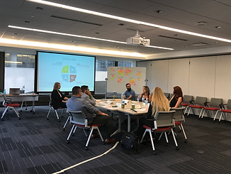
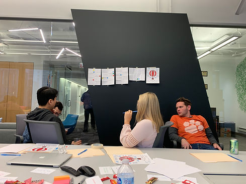
The company hosted an annual summit with our top customers, so I took this as an opportunity to conduct a workshop with a few volunteers to further flesh out the concept.
We were able to get five users into the workshop, with the goal of understanding what they typically do related to hiring. I presented this as a card-sorting exercise with all of the tasks a user could possibly complete, and asked them to sort the cards into applicable categories.
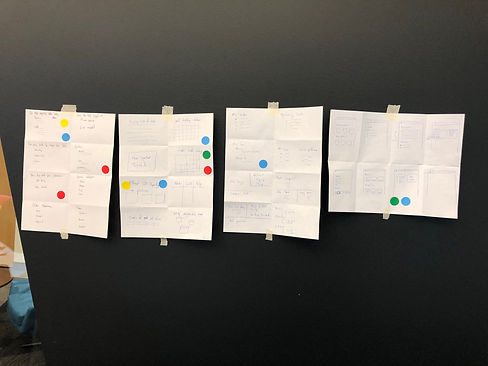
I asked everyone to label their cards and explain them to the group. We then brainstormed the larger topics and came up with buckets that aligned with their mental model (example show in the far right image below).
Workshop Participant
“I have to write everything down, I feel like I’m going to miss something in Hireology, sometimes I forget that I’ve moved them to the next step, and I’m not sure if I’ve contacted them.”

At this point, my product manager and I validated this was a consistent issue that required a task-based management system. This high-value add could greatly improve our retention rate.
Solution Brainstorming
I pulled together members of the larger product team to brainstorm ideas on how to solve this problem. I gave them a few prompts to flesh out via a Crazy 8’s exercise such as “how might we help users understand how manage prospects such as screening, sharing, interviewing, etc.?”
Then the top-voted sketches were presented to the team with time for discussion. This was a great launching point for me to dig into the designs, with plenty of ideas such as:
-
Using a Kanban board to manage tasks
-
Showing progression / the number of completed tasks
-
Highlighting analytic insights to improve efficiency
-
Showing tasks as part of a user-focused dashboard
-
Only surfacing time-sensitive tasks that need to be addressed like interviews
From here, I worked with my UX team on brainstorming options for how this could live in the UI:
Design Refinement
Once I started building concepts in Figma, there was a lot of discussion as to where this task-manager should live. On its own page separate from the hiring flows? Something a user could access as a drawer-type of list? Stick with a kanban board like our hiring team used?
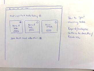
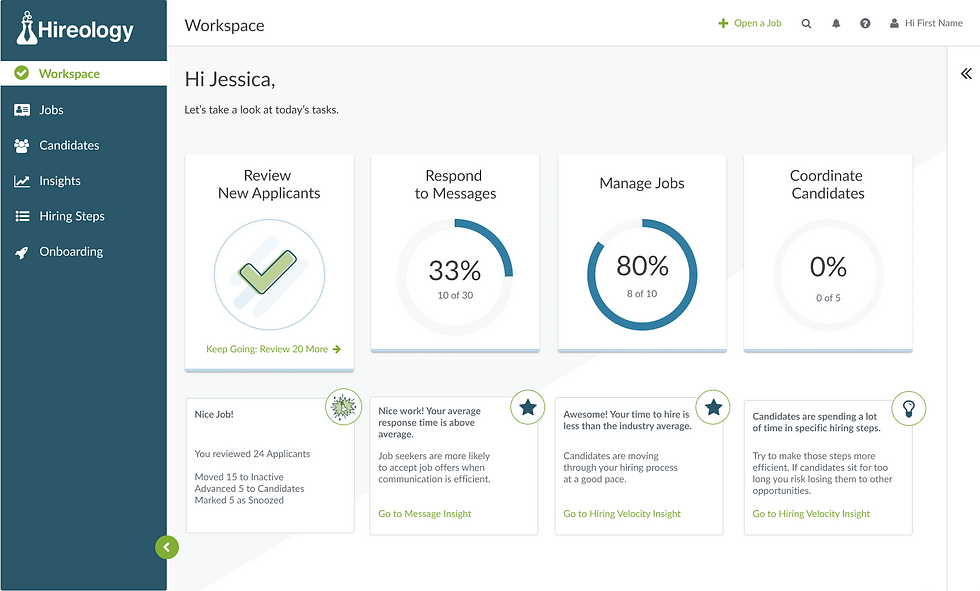
The product technically had a home page that users landed on when they logged in, but it had very low usage and was quickly skipped over in favor of individual job pages. So we decided to commandeer this page and redesign it as the user’s task manager, using the general categories from the customer workshop research, which also reduced the visual clutter and would hopefully give them a sense of confidence before diving into the nitty gritty of each category’s content.
I presented five rounds of wireframes to both the UX team and the larger product team for feedback, starting with a lot of extra content like a list of scheduled interviews, sub-categories within tasks, and a list of the applicable candidates. But the feedback from my team was consistent in it being too much visual clutter, and that it shouldn’t feel overwhelming to the user.
From a psychology perspective, I wanted to ensure some kind of progression or a count of tasks was included, as completion rates are always higher when a user understands the number of steps to go through, so I started to simplify down to a page with categories the user could jump into with more of the meat of the content.


Throughout this design process, our development team was working on a plan to overhaul the backend infrastructure, using this task manager as a framework for a new automation system. Eventually this would open the door to triggering complex workflows and a plethora of other features.
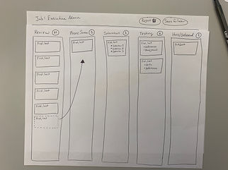
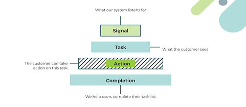
So for this first project, we needed to define what tasks could be addressed, how they were triggered, and what actions could be taken in order to show progression (logic shown on the left below).
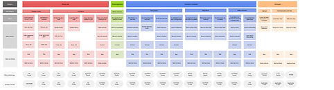
I built out a full list of the tasks for each category to help write out requirements for our development team, showing the tasks, the potential actions, and where it would live in the application (shown on the right).
Final Design
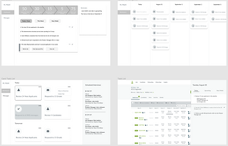
Now with the concept approved, I dug into the high-fidelity designs. We landed on this card style as it was easy to understand and provided the most useful information before leading to a page to address tasks within each task category:
There was still a sentiment from my team that users wouldn’t know the cards were clickable, so I ran a test on the prototype via UsabilityHub with a heat map. We were given a budget to present the designs to 50 people that fit within our customer segments.
68% of the participants clicked on the cards within five seconds of being on the static page. Although it was the majority, we decided it was a safe bet to incorporate a hover state animation with a drop shadow to indicate interaction.
I also circled back to our customers who participated in the onsite card sorting exercise, using the final prototype to confirm if the categories and navigation were clear, shown in the demo video below:
Large Auto Customer
"This makes my life so much easier- I just want to sit down and get through my list and now I’ve got it right in front of me."
4 of 5
participants rated the designs as a significant improvement to their workflow.
With confirmation on the usability of the designs, the project had our CEO’s full support. I was asked to present the work as a UX case study at our annual onsite with the intention of kicking off the development work shortly after.
With over 200 employees present, I wanted to get people excited about the new feature, as well as explain how the UX team worked. There was a tendency to misunderstand our role in product, so I walked them through how we created this task manager through the UX process.
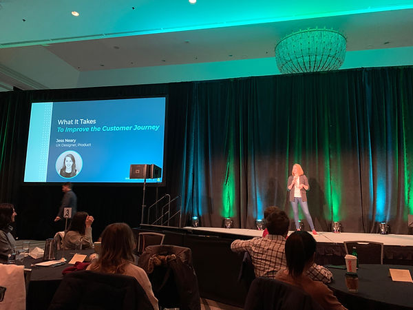
The presentation was a success. Immediately after I was approached by other team members across departments sharing their enthusiasm for the project, and wanting to be involved in future research initiatives.
Results
As I mentioned earlier, this project spurred a major backend update to not only accommodate the task management logic, but also expand into automated workflows in the future. With a major overhaul of legacy code on top of these changes, the scope of this project ballooned to months out before anything would be user-facing. I took another opportunity before I could see the designs to a release, but here were the results based on my contribution:
Long-term impact on the product
The insights from this project led to major overhaul of the backend infrastructure to enable tasks and eventually automations. It sparked a lot of other ideas and projects internally as well.
Created a dialogue about UX
The onsite presentation of this project opened the door to showing the company the value of UX. I was approached for weeks afterward from other employees who were not only excited about the project, but wanted to be involved with future research.
Improved user experience
From my tests with the high-fidelity designs via Usability Hub and user interviews, we confirmed this work would be an improvement to the user’s workflow, and we anticipated a drop in the detractors from our NPS score and CS tickets related to confusion around navigating the product.
Increased efficiency
My product manager and I built out a new analytics dashboard to track task completion rates and compare them to the same definition of tasks before this dashboard was available.
Learnings
-
If could go back, I would have refined this project down to a manageable MVP that could have been built within the existing dev framework (possibly redesigning the home page and simply linking to the applicable job’s pages), so it could be tested more thoroughly.
-
I spent a lot of time in the early design phase, gathering feedback from concepts that were visually different but essentially executed the same thing. I would be much more disciplined in the amount of options created and discussed with the team.
-
Although we didn’t have a formal KPI tracking system, I would have framed success metrics at the beginning to ensure more focus within the decision making process.